Gerhard Richter.

Image analysis.
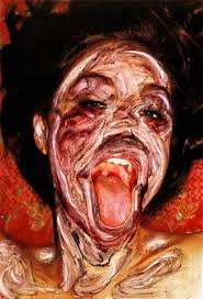
The genre of this image is landscape. The subject matter that the photographer has used is adding colour to an image of the landscape to make it look different, the colour hides away part of the image but he adds colour into the landscape in an unusual way. The subject matter is exaggerated and abstracted to create this effect on the image. The representation is about adding the colour into the landscape in his own unique way. I think that the story behind this image is that he is showing the man made colour and the natural colour combined into one image.
The photographer fills the framing of the image with colour. This shows the colour more on the image than the actual image of the landscape. But the colour does enhance the framing of the actual image in a way because as you look at the colour you notice the image more behind it. The photographer uses the paint to create a texture to the image.
I think that the photographer would have created this by taking the image and then putting the paint onto acetate and layering the paint over the image, he would have either layered them by printing the image off or doing it on photoshop and layering them that way.
I like Gerhard Richters work because he adds the colour in a different way to what other artists have done, I like the colours that he has used because they work well on the image. He has created a positive atmosphere on the image with the colour being used in a different way.
More of Gerhard Richter's images.

|

|

|
Contacts sheets.


My edits & Hanging plan.


I displayed them in this way to separate the images with two paint patterns with the ones with only one paint pattern, I think that they are all more noticeable this way and you can see them better.
My development idea.
For my developments I am going to print the images off onto glossy paper and use acetone to make the image have a similar effect to Gerhard Richter's images, A artist that uses this effect is Kuinexs. Kuinexs uses paint thiner to recreate the image, however I am going to use acetone which will have the same effect and let the ink run from the image.
Kuinexs' images.

|

|
|
My developments & Hanging plan.


I displayed them in this way because I like how the images with sky fit together and how the ones without the sky fit together.
Developing the original edits.


To develop my original edits I decided to cut out shapes from the paint that I had scanned in. while creating these I thought about changing the colours and grouping small ones together to create the last two edits.
Developments.


I developed these further by making the image black and white and leaving the paint in colour to show the colour in the landscape.
Conclusion.
Overall, I liked recreating my version of Gerhard Richters work because he has chosen a different way to capture the colour in the natural landscape by adding the colour in a different way. His work is very creative that I really enjoyed creating. At first I thought that his work was done by just adding the paint onto the image, however when I thought about it more it seemed that they had been done differently, I thought about putting the acrylic onto acetate and scanning the paint into Photoshop and editing them that way. I also like the way that the developments turned out because they were an unusual way of creating them.
